10 Ways to Analyze Financial Data: (How FP&A Teams Use Each One)

Every finance team has more data than it knows what to do with. Reports pile up. Dashboards multiply. Data exports land in your inbox faster than you can open them.
But data on its own does not tell you anything. A spreadsheet full of numbers is just noise until someone asks the right question of it.
That someone is usually FP&A.
FP&A teams sit at an interesting spot in the business. Accounting tells you what already happened. FP&A explains why it happened. Then it tells you what it means for next month, next quarter, and next year.
Read: What Great Financial Reporting and Analytics Actually Look Like
To do that well, FP&A relies on a toolkit. Not software. Techniques. Ways of slicing, comparing, and questioning data until a story falls out of it.
The best analysts are not the ones who can build the fanciest model. They are the ones who know which question to ask, and which technique answers it. The rest is execution.
This article walks through ten of those techniques. For each one, you get an explanation of what it is. Then you get to see how FP&A teams actually use it day to day. And a few examples.
One quick note before we start. Each of these methods is far easier when your data lives in one connected place instead of fourteen spreadsheets. Tools like Farseer exist for exactly that reason. They turn these techniques from heroic one-off efforts into something you can run on repeat. More on that as we go.
Let’s get into it.
Way 1: Drill Up and Drill Down
This is the most basic move in the FP&A playbook. It is also the one you use most.
- Drilling down means moving from a summary number into the detail behind it. You start at the top. Total revenue. Total cost. Total margin. Then you go deeper. Revenue by region. Region by product. Product by customer.
- Drilling up is the same trip in reverse. You take a tiny detail and zoom back out to see how much it matters at the company level.
Here is how it plays out in real life. Your operating expenses came in over budget. The total looks bad. So, you drill down. You find one department is responsible. You drill again. It turns out one vendor invoice landed twice. Mystery solved in three clicks.
Then you drill back up. That double invoice was painful for the department. But at the company level it barely moves the needle. Now you can walk into the review meeting with the full picture instead of a guess.
That is the real value here. Drill up and drill down stops you from hand-waving. It forces you to find the actual cause. And it lets you size that cause correctly before you raise the alarm.
Way 2: Slicing and Dicing
Slicing and dicing is about looking at the same data from different angles.
You have one dataset. Sales, say. You can cut it by region. You can cut it by product line. You can cut it by channel. You can cut it by customer segment or by month. Same numbers. Completely different stories.
This matters more than it sounds. A single total can hide a lot.
Imagine your total revenue is flat year on year. On the surface, nothing to see. Boring quarter. But slice it by product. Suddenly one product line is up forty percent while another has collapsed by the same amount. They cancel out at the top. The flat total was lying to you.
Read: How to Build a Revenue Model: A Step-by-Step Guide
Here is another one. Total customer numbers are growing. Marketing is thrilled. But slice the same data by channel and a different picture appears. One acquisition channel is bringing in cheap, loyal customers. Another is bringing in expensive ones who churn in a month. The growth is real. The quality is not. Only the slice reveals that.
FP&A teams live in this mode. They rarely accept a number at face value. They cut it three or four ways before they trust it. The insight almost never sits in the headline figure. It sits in the angle you choose to view it from.
The skill is knowing which angle to try first. That comes with knowing the business. A good analyst already has a hunch about where the story is hiding before they cut the data. The slicing just confirms it.
Way 3: Horizontal and Vertical Analysis
These two go together, so we will cover them as a pair.
Horizontal analysis looks across time. You line up this period next to prior periods. You calculate growth rates. You spot momentum. Is revenue climbing? Is it slowing? Has a cost line crept up over six months without anyone noticing?
Vertical analysis looks within a single period. You take each line item and show it as a percentage of a base. On a profit and loss statement, that base is usually revenue. So, every cost becomes a share of sales.
This second view is powerful. It is sometimes called a common-size statement.
Here is why FP&A loves it. Your revenue might be growing nicely. Everyone is happy. But run a vertical analysis and you might find that the cost of goods sold is quietly eating a bigger slice of every sale. Margins are eroding even as the top line grows. Horizontal analysis alone would have missed it.
Use them together. Horizontal tells you the direction. Vertical tells you the structure. Side by side, they catch problems that either one would miss on its own.
Way 4: Segmentation
Segmentation means grouping the business into chunks that actually mean something.
Those chunks could be customer tiers. They could be product families. They could be regions, channels, or how each customer was acquired.
A company might report a healthy overall margin. But segment the customers and the truth comes out. Maybe twenty percent of customers drive eighty percent of the profit. Meanwhile, a long tail of small accounts is quietly losing money on support and servicing costs.
You would never see that from the total. The profitable customers are subsidizing the unprofitable ones, and the average makes everyone look okay.
FP&A teams use segmentation to find where value is really created. And where it is being destroyed. Once you know that, you can have a serious conversation about pricing, focus, and which customers to chase. We will come back to this idea when we reach profitability analysis later on.
Way 5: Driver-Based Relationships
A driver-based relationship connects an operational input to a financial output. Headcount drives payroll costs. Units sold drive revenue. Website traffic drives leads, which drive bookings, which drive cash.
Instead of typing a revenue number into your forecast, you build the logic behind it. You model the drivers. Then revenue becomes the result of those drivers, not a number you plugged in by feel.
Read: Everything You Need to Know About Driver-Based Forecasting
The payoff is huge. When an assumption changes, the whole model updates on its own. Sales tells you the average deal size is dropping. You change one input. The change cascades through the entire forecast automatically. Revenue, margin, cash, all of it.
This is exactly the kind of work that punishes spreadsheets. Linked formulas break. One wrong cell reference and the whole model is wrong, often silently.
This is where a platform like Farseer earns its place. You define the driver logic once. You connect your operational drivers to your financials. Then the model recalculates instantly whenever an input moves. You spend your time analyzing the result instead of rebuilding the math. That shift, from maintaining spreadsheets to actually thinking, is the whole point of driver-based planning.
Way 6: Ratio Analysis and Benchmarking
Ratios give you the numbers. Benchmarking gives them meaning.
Start with ratio analysis. Ratios are the vital signs of a business. There are four broad families.
- Liquidity ratios show whether you can pay your bills.
- Profitability ratios show how much you keep.
- Efficiency ratios show how hard your assets are working.
- Leverage ratios show how much debt you are carrying.
Read: What is Ratio Analysis And How To Make the Most of It
FP&A teams track these over time. Gross margin percent. Current ratio. Days sales outstanding. Return on invested capital. When one of them starts drifting, it is an early warning. Often it shows up before the problem hits the bottom line.
Take days sales outstanding as an example. It measures how long customers take to pay. If it creeps up from thirty days to forty-five, your profit might look fine. But your cash is arriving later and later. That ratio caught a cash problem that the income statement was happy to ignore.
But a ratio on its own is incomplete. Say your net margin is fourteen percent. Is that good? You cannot answer that yet.
That is where benchmarking comes in. You compare the ratio against something. Against your own past. Against your internal target. Against your industry peers.
Now the fourteen percent has context. If your peers run at seven percent, you are a star. If they run at twenty-eight percent, you have a serious efficiency problem hiding behind a number that looks fine.
Ratios without benchmarks are trivia. Benchmarks without ratios are vague. Put them together and you get judgement. That is what FP&A is paid for.
Way 7: Data Visualization
You can do the most brilliant analysis in the world. If you present it as a forty-row table, no one will read it.
Data visualization is the art of turning numbers into pictures. Charts. Dashboards. Bridges. Heatmaps. The goal is simple. Make the insight obvious at a glance.
Executives do not have time to study a spreadsheet. They have five seconds and a lot on their minds. A good chart respects that. A waterfall chart can explain a whole quarter of profit movement in one look. A trend line can show momentum without a single number being read aloud.
FP&A teams use visuals as the final mile of analysis. The thinking happens in the model. The landing happens in the picture. If the picture is bad, the thinking never reaches anyone.
A few rules help here. Pick the right chart for the message. A pie chart and a trend line answer different questions. Strip out the clutter. Lead with the insight, not the raw data. The chart title should state the takeaway, not just label the axis.
There is a practical catch with visuals, though. They go stale fast. A chart pasted into a slide is a snapshot from the moment it was made. By the next meeting it is often wrong.
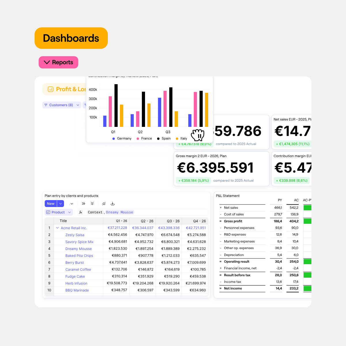
This is another spot where Farseer helps. Because its dashboards sit on top of a live model, the visuals stay current on their own. You are not exporting screenshots that expire by lunchtime. You are looking at the real numbers as they stand right now. That alone saves FP&A teams hours of rework before every board meeting.
Way 8: Seasonality and Trend Analysis
Some patterns repeat. Some patterns are real change. Telling them apart is the whole game here.
Seasonality is the predictable rhythm of a business. Retail spikes in December. Many SaaS companies see renewals cluster in certain quarters. These swings happen every year, like clockwork.
Trend is the underlying direction once you strip the seasonality out. Is the business actually growing? Or does it just look like it because you caught it in a strong season?
FP&A teams use this distinction to avoid two classic mistakes.
The first mistake is panic. Revenue dips in January. Someone sounds the alarm. But January dips every single year. It is seasonal, not a crisis. A trend view would have shown the business is perfectly healthy.
The second mistake is false confidence. A big seasonal quarter makes everything look great. The team relaxes. But the underlying trend was flat or declining the whole time. The season masked it.
The fix is to compare like with like. Year on year often beats month on month. And once you understand both the trend and the seasonal shape, your forecasts get far more accurate. You stop being surprised by patterns you should have seen coming.
Way 9: Profitability Analysis
Most companies know their total profit. Far fewer know where that profit actually comes from.
Profitability analysis breaks profit down to a granular level. By product. By customer. By channel. By project. The aim is to find out what truly makes money once you load in the real costs.
That last part is where it gets interesting. The real costs.
A product might look profitable on a simple margin calculation. But add in the cost to serve. Returns. Support tickets. Shipping. Discounts. Suddenly your hero product is barely breaking even. And the boring product nobody talks about is quietly carrying the business.
This is the kind of finding that changes strategy. It tells leadership where to push and where to pull back. It informs pricing. It informs which deals are worth chasing and which ones are a trap.
A classic example is the big customer who demands deep discounts. On paper they look great. Huge revenue. The sales team celebrates the logo. But run full profitability and the truth lands hard. After the discounts, the custom work, and the extra support, that account makes almost nothing. A handful of smaller, full-price customers quietly out-earn them. Without profitability analysis, you would keep chasing the wrong wins.
Profitability analysis pairs naturally with segmentation from earlier. Segment the business into meaningful groups. Then run profitability across those groups. Together they answer one of the most important questions in finance. Not how much do we make, but where do we make it.
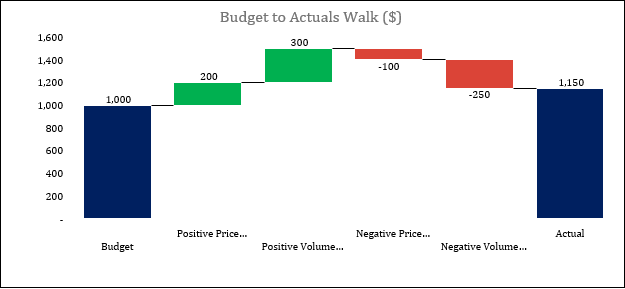
Way 10: Price, Volume, Mix and FX
This is the most advanced technique on the list. It is also the one that makes FP&A teams look like magicians in a meeting.
Price, Volume, Mix and FX is usually called a PVM bridge. It decomposes a change in revenue or margin into its real causes. It answers the question every CFO eventually asks. Revenue grew eight percent, but why?
There are four possible drivers behind that growth.
- Did you sell more units? That is volume.
- Did you charge higher prices? That is the price.
- Did your sales shift toward different products with different margins? That is a mix.
- And did currency movements help or hurt the reported number? That is FX.
A weak FP&A answer is a shrug and a guess. A strong answer is a bridge that shows exactly how much each driver contributed.
The insights can be uncomfortable. Revenue might be up while margin is down, because the mix shifted toward cheaper products. Or the headline growth might be mostly FX, which means the underlying business barely moved. Or a price increase quietly offset a drop in volume, which is a very different story from organic demand.
PVM ties almost everything else on this list together. Volume connects to your trend analysis. Mix connects to segmentation. Price connects to profitability. Get good at it and you can explain any movement in the numbers with precision instead of opinion.
Bringing It All Together
You do not need all ten of them every single day. That is not the point.
The point is to build a toolkit. A strong FP&A function knows which technique answers which question. Variance in the total? Drill down. A number that looks flat but feels wrong? Slice it. A forecast that keeps breaking? Build it on drivers. A CFO asking why revenue moved? Reach for a PVM bridge.
The techniques themselves are not new. Finance teams have used versions of them for decades. What has changed is how fast you can run them.
When your data is scattered across spreadsheets, every one of these methods is a chore. You spend most of your week wrangling exports and chasing broken links. The analysis gets squeezed into whatever time is left.
When your data is connected, the chore disappears. You build a driver-based model once. Your dashboards update on their own. Your ratios, your bridges, your trend views all sit on the same source of truth. The grunt work shrinks. The thinking expands.
That is the case for a modern planning platform. Farseer is built for finance teams who want to spend their time analyzing rather than wrestling with spreadsheets. Driver-based models, live dashboards, and a single connected data layer mean these ten techniques stop being a fire drill and start being routine. If your team is trying to do more of this kind of analysis with less manual effort, it is worth seeing how Farseer handles it at farseer.io.
One last thought to leave you with. The analysts who stand out are not the ones with the most data. Everyone has too much data now. The ones who stand out are the ones who ask the sharpest questions of it. Pick a couple of these techniques. Get genuinely good at them. The data will start talking back.

FAQ
What are the most common financial data analysis techniques used in FP&A?
The most common financial data analysis techniques used in FP&A include drill-down analysis, slicing and dicing, horizontal analysis, vertical analysis, segmentation, driver-based analysis, ratio analysis, trend analysis, profitability analysis, and Price Volume Mix (PVM) analysis. Together, these techniques help finance teams turn raw data into business insights.
How do FP&A teams analyze financial data?
FP&A teams analyze financial data by identifying trends, comparing actual results against plans, segmenting performance, analyzing profitability, monitoring KPIs, and investigating the operational drivers behind financial outcomes. The goal is not just to report numbers but to explain why performance changed and what is likely to happen next.
What is drill-down analysis in FP&A?
Drill-down analysis is the process of moving from a high-level summary number into the detailed transactions, products, customers, or departments that make up that number. FP&A teams use drill-down analysis to identify the root causes behind variances, performance issues, and unexpected results.
What is slicing and dicing data?
Slicing and dicing are financial data analysis techniques that allow analysts to view the same dataset from different perspectives. For example, revenue can be analyzed by region, product, customer, channel, or time period. This helps uncover insights that may be hidden in summary-level reporting.
What is horizontal and vertical analysis?
Horizontal analysis compares financial performance across multiple periods to identify trends and growth rates. Vertical analysis expresses financial statement line items as a percentage of a base figure, such as revenue. FP&A professionals often use both techniques together to evaluate performance and profitability.
What is driver-based analysis in financial planning and analysis?
Driver-based analysis links operational activities to financial outcomes. Instead of forecasting revenue or costs directly, FP&A teams model the business drivers behind them, such as headcount, units sold, utilization, pricing, or customer growth. This creates more accurate and flexible forecasts.
Why is profitability analysis important?
Profitability analysis helps businesses understand which products, customers, channels, projects, or regions generate the most profit. It allows finance teams to identify high-performing areas, uncover hidden losses, improve pricing decisions, and allocate resources more effectively.
What is Price Volume Mix (PVM) analysis?
Price Volume Mix (PVM) analysis is a financial analysis technique used to explain changes in revenue or margin. It breaks performance into four drivers: price changes, volume changes, product mix changes, and foreign exchange (FX) movements. FP&A teams use PVM analysis to explain business performance with greater precision.
What are the benefits of data visualization in FP&A?
Data visualization helps FP&A teams communicate insights more effectively. Charts, dashboards, waterfall bridges, and trend analyses make complex financial information easier to understand, helping executives make faster and more informed decisions.
What software is used for financial data analysis and FP&A reporting?
Many finance teams start with Excel for financial data analysis. As complexity grows, organizations often adopt dedicated FP&A platforms such as Farseer, Anaplan, Jedox, Pigment, or Adaptive Planning. These tools support driver-based planning, profitability analysis, dashboards, scenario modelling, and advanced reporting.

What Great Financial Reporting and Analytics Actually Look Like
Read more
Ad Hoc Reporting for Finance Teams Who Can’t Wait on IT
Read more