How to Build a P&L Dashboard in Farseer (Step-by-Step)
Every FP&A team hits the same challenge. You build a clean P&L. The structure is logical, the subtotals tie out, and you actually trust the numbers. Then someone asks how it compares to last year, and you find yourself exporting to a spreadsheet, manually formatting a summary tab, and rebuilding a presentation that will be obsolete again in three weeks.
The problem is not your model. The problem is that reporting and modelling are being treated as the same job when they are not.
Read more: What Great Financial Reporting and Analytics Actually Look Like
Farseer separates them properly. You build the financial logic once in Sheets, then reuse that exact work inside Dashboards as a reporting layer. No rebuilding, no duplicate logic, no parallel version of the truth drifting away from the model.
This article walks through building a complete P&L dashboard in Farseer from a blank canvas: A full report with plan-versus-actual comparison, KPI cards for EBITDA and EBIT, and a focused chart for operating performance. Along the way, it covers the dashboarding principles behind each step, because knowing which button to click matters far less than knowing why you are clicking it.
The Idea Behind Farseer Dashboards
Farseer dashboards work as a lightweight reporting layer that sits on top of your existing model. Let’s understand what this means.
The dashboard does not calculate anything. It does not hold its own logic. It reads from the structure you already built in Sheets and presents it differently. Think of Sheets as the kitchen and Dashboards as the dining room. One is where the work happens. The other is where the report gets plated.
This separation is what most spreadsheet-based reporting gets wrong. When your model and your presentation live in the same file, the model slowly fills up with formatting tweaks, hidden helper columns, and one-off charts that break the moment someone inserts a row. Keep them apart and your model stays clean while your reporting stays sharp.
It also means a P&L dashboard in Farseer is mostly an act of reuse. You are not rebuilding EBITDA. EBITDA already exists in your P&L sheet, calculated correctly, with every component feeding into it. You are just taking that row and showing it as a KPI card instead of a table row. That is the whole idea behind Farseer dashboards. Reuse over rebuild, at every step below.
Before You Start: The Structure Has to Be Right
A dashboard inherits whatever discipline exists in your model. If your P&L rows are inconsistently named or do not roll up cleanly into subtotals, no amount of dashboard polish will rescue them. The presentation layer can only present what the structure gives it.
So, before you create a single tile, make sure your P&L sheet in Farseer has a clear hierarchy. Operating revenue and other revenue should roll into total revenue. Operating expenses, financial expenses, and depreciation and amortization should sit in groups that produce the subtotals you actually report on. Your version columns, things like 2023 Actual and 2024 Plan, should be clearly labelled and pointed at the right periods.
The example throughout this guide assumes that groundwork is done. There is a P&L sheet with proper structure, period columns for 2023 and 2024, and subtotal rows for EBITDA, EBIT, and net profit. That is the raw material. Everything from here is repackaging.
Step 1: Create The Dashboard and Understand Your Building Blocks
In Farseer, dashboards are created directly inside the application. Right-click in the dashboards area and select the option to create a new one. It opens as a blank canvas.
Farseer gives you two basic building blocks, and knowing what each is for shapes everything that follows:
- Sheet tiles, where you bring in rows, hierarchies, and values from your sheets. These carry the actual financial content.
- Text tiles, where you enter plain text for titles, labels, or notes. These carry context.
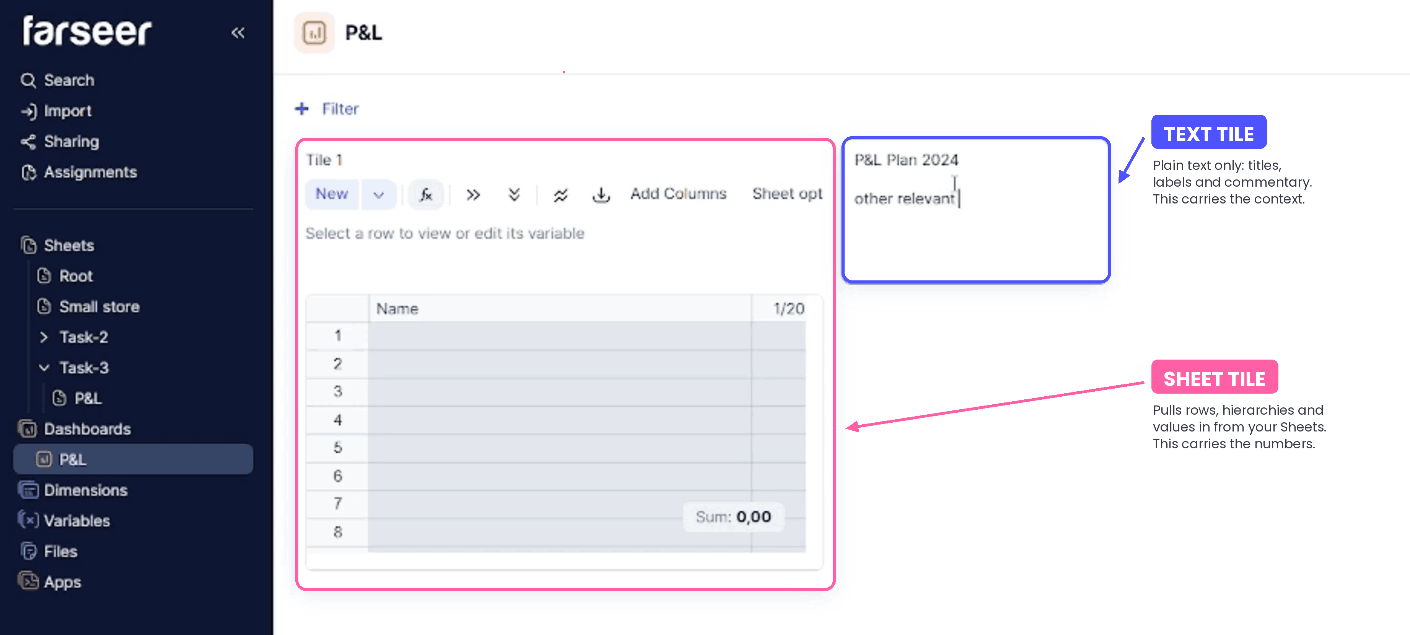
You need both. A dashboard built only from sheet tiles reads like a database export, and readers have to work out for themselves what they are looking at. A few well-placed text tiles turn a grid of numbers into something that guides the eye. Numbers show what happened. Words show why it matters.
Every tile in Farseer can be renamed, repositioned, and redisplayed later, so it is faster to get content onto the canvas and tidy afterwards than to plan the perfect layout upfront.
Step 2: Add The Main P&L Report Tile
The anchor of any P&L dashboard is the income statement itself. That will be our first tile.
Double-click a sheet tile to open its settings, and rename it P&L Plan 2024. While you are here, add two more sheet tiles and set them aside. They become your KPI cards in Step 6, and creating them now saves interrupting your flow later.
To populate the main report, go back to the P&L sheet where the structure already exists. Copy the relevant rows, return to the dashboard tile, and paste them in.
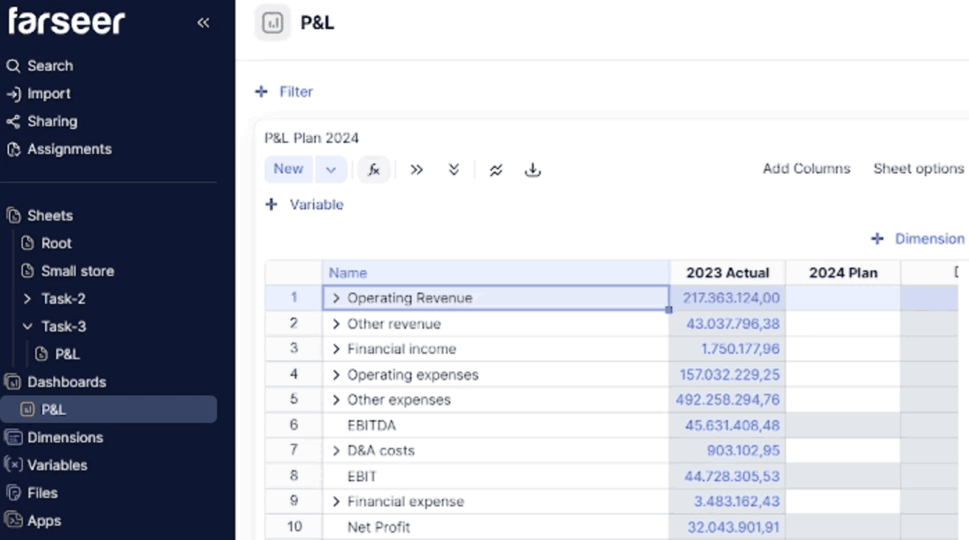
Copy-paste is one route; sheet referencing, where the tile points at an existing sheet, is the other, and often quicker for restyling a finished report.
You are not retyping anything. You are not rebuilding logic. You are pulling in rows you already trust, which means the dashboard cannot disagree with the model. In spreadsheet reporting, that disagreement is exactly where credibility goes to die.
A few details matter here: The timeline has to match the periods you actually want to report. If it is wrong, the tile will still work perfectly. It will just quietly show the wrong year, and you may not notice until someone in the meeting does. Set it correctly before moving on.
Step 3: Switch To Report View
After pasting the rows, the tile is still a basic data container. Open the tile settings and change the view type to Report View.
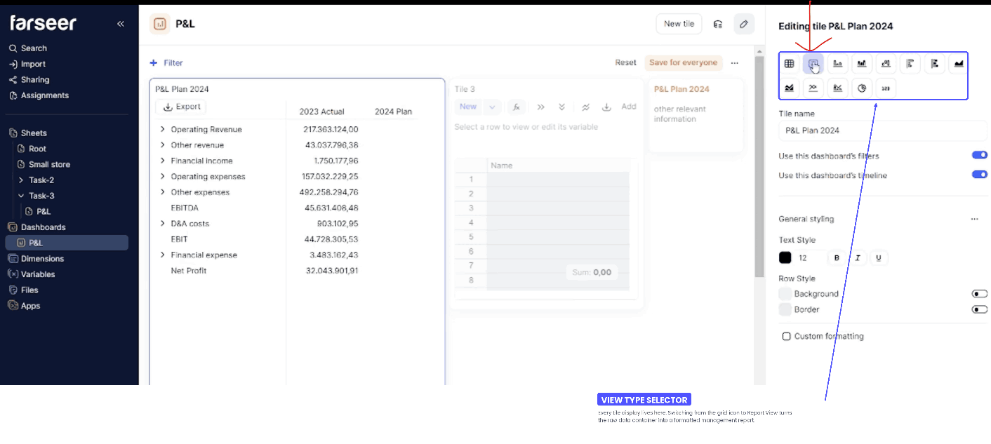
Report View transforms the tile into something that looks and behaves like a proper report, and from there you can format the lines however you find appropriate.
In Sheets, you optimize for calculation. In Report View, you optimize for the reader.
Step 4: Create a 2024 Plan From 2023 Actuals
For this example, we are making up some plan numbers for 2024. In reality, you will already have a plan to compare your actuals against.
Return to the P&L sheet and fill out the 2024 plan values. The quickest route is to copy the 2023 actuals into the 2024 plan column for all of the white input cells. Farseer distinguishes input cells from calculated ones, which is a small thing that saves real pain. You physically cannot overwrite a formula-driven subtotal by accident.
At that point, 2023 actual and 2024 plan are identical. That is deliberate. It gives you a clean baseline to layer assumptions onto, so every difference you see afterwards is traceable to a decision you made rather than to something you forgot to update.
From there, we make two small planning adjustments:
- Increase operating revenue by 5%
- Decrease operating expenses by 3%
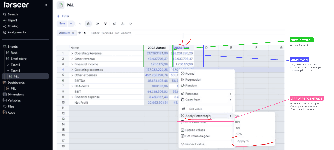
Note: For this demo our point is not to model a sophisticated budget. It is to create enough movement that the dashboard has something to show. These two work well because they hit both sides of the equation, so the effect compounds as it flows up through the subtotals into EBITDA, EBIT, and net profit.
Step 5: Use Comparisons to Highlight What Changed
Back in the dashboard, the fastest way to spot the differences is the comparison menu on your report tile. This is where the dashboard stops describing the business and starts interpreting it.
The comparison menu gives you three decisions:
- Which versions to compare. Here, 2024 Plan against 2023 Actual.
- How to compare them. The calculation method behind the difference.
- How the difference should be expressed. Values, percentages, or another format.
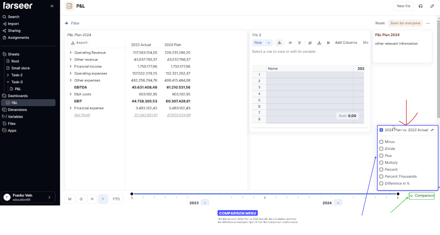
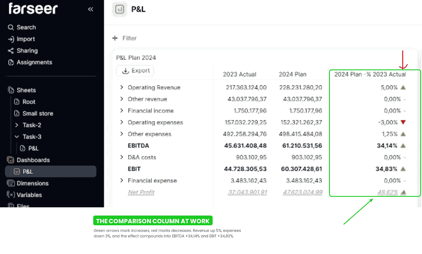
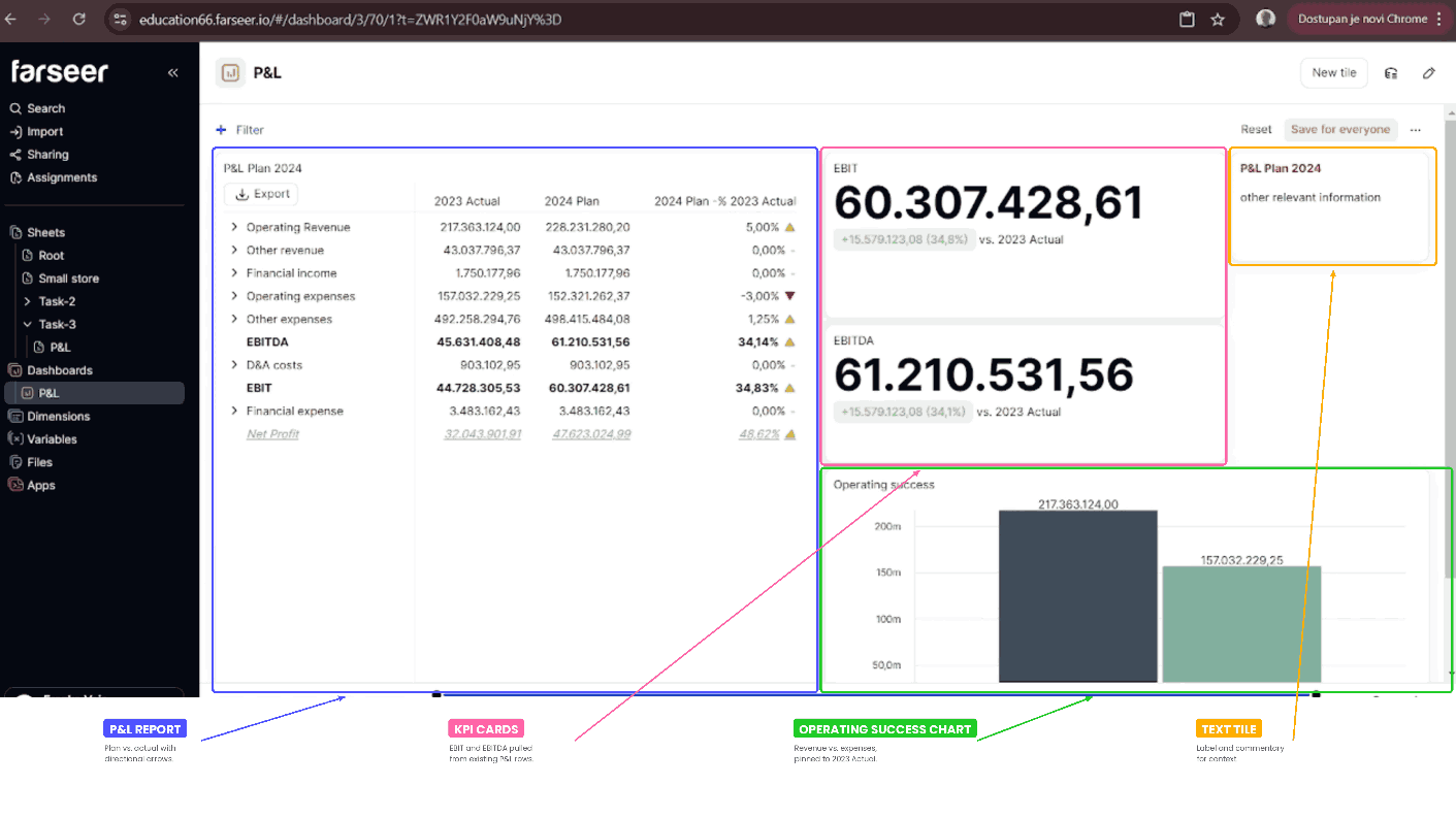
Apply it, and the changes appear directly in the report. The 5% revenue lift and 3% expense cut do not just move two rows. You see the full cascade at once. In this example, EBITDA moves from roughly 45.6 million actual to about 61.2 million planned, a lift of around 34%, and EBIT follows a similar path from roughly 44.7 million to 60.3 million.
You can also format the comparison so it is easier to scan. A genuinely useful option is adding arrows or traffic lights to indicate which lines increased and which decreased.
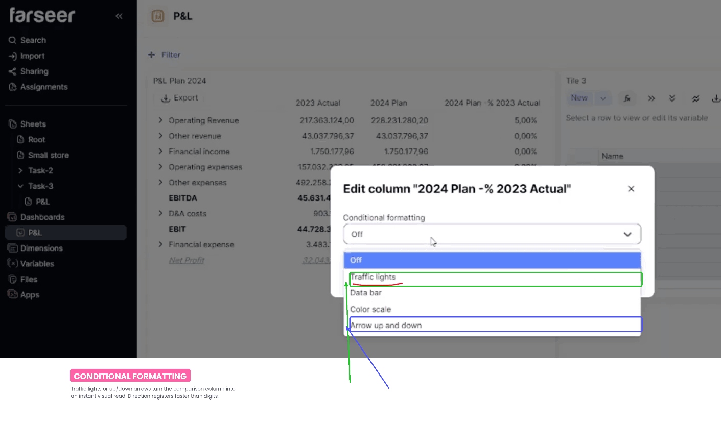
Direction and colour register faster than digits do. In a review meeting, that means the conversation starts at “why did this move” instead of “where did this move,” which is precisely where FP&A earns its keep.
Step 6: Build KPI Tiles For EBITDA And EBIT
A full P&L is essential, but it is also dense. Most executives do not want to scan twenty rows to find the two numbers they care about. That is what KPI cards are for, and this is where those two spare sheet tiles finally earn their place.
Rename one tile EBITDA and the other EBIT.
Then we go back to the P&L sheet, copy the EBITDA row, paste it into its tile, and change the view so it displays as a KPI card. Repeat the identical process for EBIT.
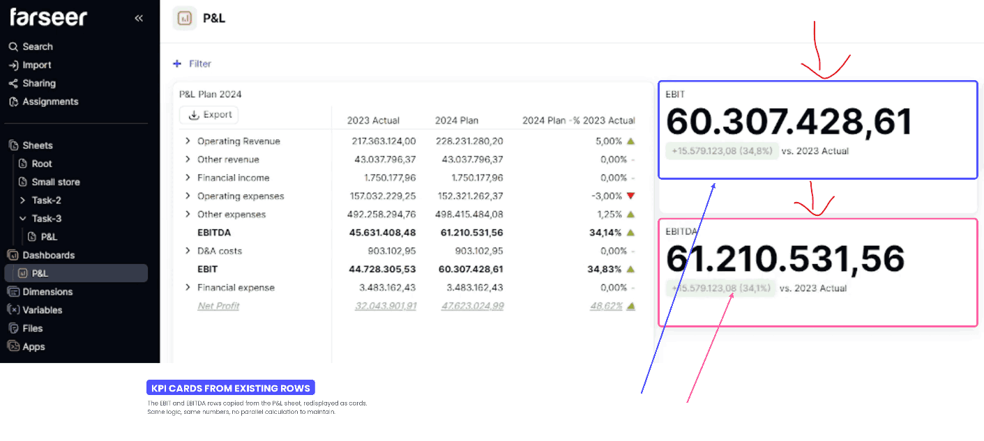
Because these rows already exist in the report structure, turning them into KPIs is mainly a matter of selecting the right row and choosing the right display.
The KPI card is not a separate hand-built calculation that has to be maintained in parallel. It is a presentation view of a row that already exists and is already correct. When the model updates, the KPI updates. There is no version of this where your dashboard says one thing and your P&L says another.
There is one useful trick worth knowing. If you want to control what the KPI compares against, say you want 2024 plan versus actuals specifically, go back to the sheet view inside the tile and drag the relevant column in front of the actuals column. Return to the KPI view and the comparison follows the order you just set.
That means you can influence KPI logic without rebuilding the tile. You adjust the row layout in the sheet-backed tile and let the tile reflect the new comparison. It is a small piece of column choreography that gives you precise control over the message.
Two to four headline metrics are plenty. The full P&L report is already on the dashboard for anyone who wants detail. KPI cards exist to highlight, not to duplicate, and past a handful they stop functioning as highlights at all.
Step 7: Create A Focused Operating Success Tile
To finish the dashboard, let’s add one more tile comparing Operating Revenues against Operating Expenses. Numbers do the job, but a chart lands the relationship instantly, and the contrast between what a business earns and what it spends is one of the most intuitive stories in finance.
Next open the tile settings and disable the dashboard timeline for this tile specifically. You only want this visual showing 2023 actual, so it should not inherit the broader timeline behaviour from the rest of the dashboard.
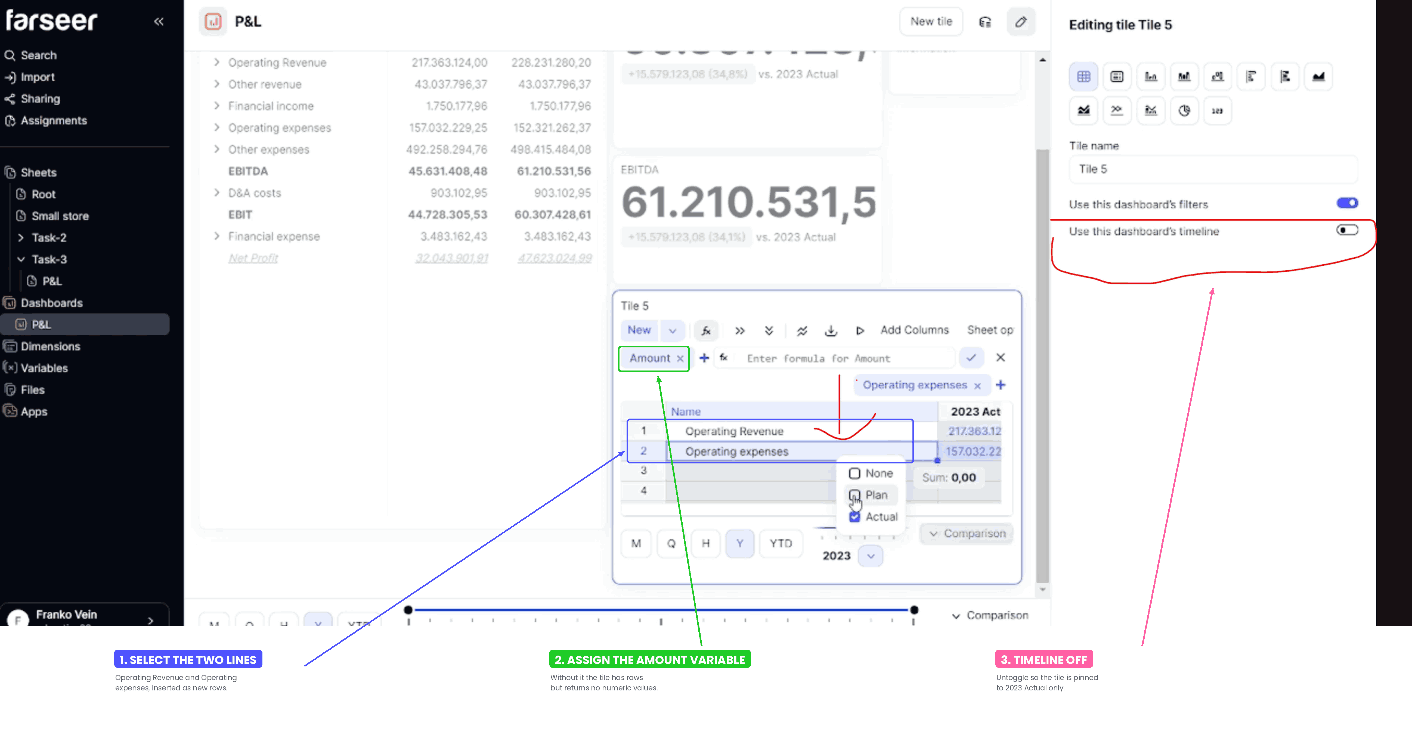
Any tile designed to make one specific point should be insulated from controls that could quietly change that point. This tile is not for broad period analysis. It is a fixed, focused comparison of two lines in one chosen year. If it floated with the global timeline, a stray click during a meeting would silently rewrite the message. Pinning it keeps the comparison stable and intentional.
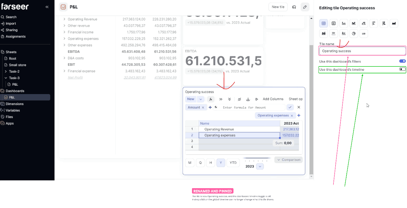
Finally, rename the tile Operating Success, since it compares the two main operating lines directly.
Step 8: Choose The Right Visualization
The last step is picking a chart type for the Operating Success tile. Since you are comparing revenues and expenses side by side, a simple column visualization works well.
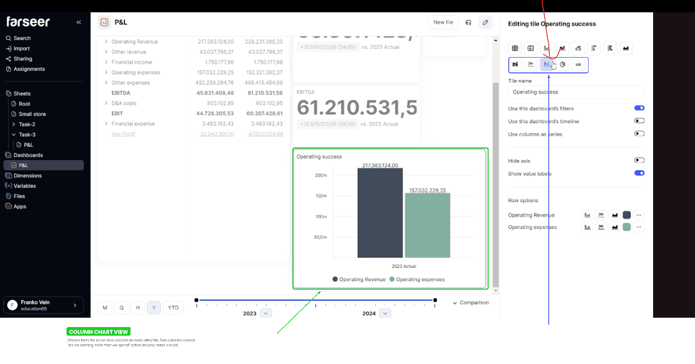
What the finished dashboard contains
Step back and look at what we have built. The dashboard includes:
- A full P&L Plan 2024 report in Report View
- Comparison logic between plan and actual, with directional arrows
- EBITDA and EBIT KPI tiles
- An Operating Success chart for revenues versus expenses, pinned to a single period
A CFO can land on this page and understand the period in under a minute without asking you to narrate it. That is the goal.
Read: Financial Data Quality Management: A Practical Framework for FP&A Teams
Why This Approach Works
What makes this workflow hold up is that it stays close to the data model. You build the financial logic in Sheets, then reuse that work inside Dashboards. Nothing gets duplicated, so nothing gets messed up.
That gives FP&A teams a few concrete advantages:
- No duplicated report logic. The dashboard cannot contradict the model, because it is reading from it.
- Reporting layouts get built fast. Copy rows, paste, change the view, set the comparison. That is the whole loop.
- Detailed tables, KPI cards, and visual summaries live in one place. No stitching together exports from three tools.
- Comparisons and formatting can be adjusted without rebuilding anything. Change your mind about what to compare, and you change a setting rather than a file.
The compounding benefit shows up next month. Because the dashboard is wired to the model rather than copied from it, updating is a refresh rather than a rebuild. You update figures in Sheets and the linked tiles, comparisons, and KPI cards reflect the new numbers. The first build takes effort. Every one after that is close to free.
For simple internal reporting, financial review, and KPI monitoring, that is often exactly what a finance team needs. Not a heavyweight BI project. Just a reporting layer that sits where the numbers already are.
The Key Takeaway
- A P&L dashboard is about closing the gap between work you have already done and the insight your business needs from it.
- Build the financial logic properly in Sheets.
- Bring it into Dashboards through reuse rather than rebuilding.
- Let KPI cards carry the headlines, and let one well-chosen chart do the work of a data table.
Do that once, and monthly reporting stops being a construction project. It becomes a refresh, which frees you up for the part of the job that actually needs a human: explaining the why behind the numbers.
Before you build yours: download the free P&L Dashboard Design Checklist you can download and reuse

FAQ
What is the difference between a sheet tile and a text tile in Farseer dashboards?
A sheet tile displays data coming from sheets, such as hierarchies, rows, and values, so it carries the financial content of the dashboard. A text tile only contains written text, which makes it useful for titles, labels, or short explanations. Most good dashboards use both, because numbers without context are harder to act on.
How do I turn a P&L sheet into a dashboard report?
Copy the relevant rows from the P&L sheet, paste them into a sheet tile on the dashboard, then switch that tile to Report View. From there you can format the report as needed. Because you are reusing rows from the sheet rather than retyping them, the report is built in a few clicks.
How can I compare a 2024 plan against 2023 actuals?
Use the comparison options inside the dashboard tile. Choose the versions to compare, define the comparison style, and decide whether the difference should be shown as values, percentages, or another format. Adding arrows to indicate increases and decreases makes the result far quicker to scan.
Can I create KPI cards from existing P&L lines?
Yes, and it is the fastest way to build them. Copy the relevant line, such as EBITDA or EBIT, into its own sheet tile and change the display so the tile behaves like a KPI card. Since the row is already calculated in the model, you never rebuild the underlying logic.
Why would I disable the dashboard timeline for a tile?
Disable it when a tile should show a fixed period only. In this example, the operating revenues versus expenses tile is pinned to 2023 actual, so it keeps showing that comparison regardless of how the overall dashboard timeline changes. It protects a tile that exists to make one specific point.
What should a simple financial dashboard include?
A solid starting point is a detailed P&L report, one or two comparison columns, a few KPIs such as EBIT and EBITDA, and a small chart highlighting a core relationship like revenues versus expenses. That combination covers detail, movement, headline metrics, and a visual read in a single view.
Do I need to rebuild the dashboard every month?
No. Because the dashboard reads from your sheets rather than holding its own copy of the data, updating it is a refresh rather than a rebuild. You update the model and the tiles follow.
How do I control what a KPI card compares against?
Switch the tile back to sheet view and rearrange the columns by dragging the one you want in front of the actuals column. When you return to the KPI view, the comparison follows that order. It lets you change the comparison without rebuilding the tile.
Can I combine KPI cards, reports, and charts on the same dashboard?
Yes. In fact, that is considered a best practice. A well-designed financial dashboard combines a detailed report for analysis, KPI cards for headline metrics such as EBITDA and EBIT, and charts that highlight key trends or comparisons. This gives executives both a quick summary and the ability to drill into the supporting detail without switching between multiple reports.
How do I update a P&L dashboard when new actuals are available?
You do not need to rebuild the dashboard. Because Farseer dashboards read directly from the underlying Sheets, updating the financial model automatically refreshes the linked report tiles, KPI cards, and charts. This allows finance teams to spend less time maintaining reports and more time analysing the results.

What Great Financial Reporting and Analytics Actually Look Like
Read more
Ad Hoc Reporting for Finance Teams Who Can’t Wait on IT
Read more