The Weekly Flash Report: What to Include and How to Automate It
By the time the month-end board pack lands, the numbers inside it are already two to three weeks old. Something went wrong in the first week of the month? Leadership finds out in the second week of the next one. That gap is where many companies bleed money quietly.
The weekly flash report closes that gap.
A flash report is a short, high-frequency snapshot of business performance. Usually weekly. Sometimes daily in fast-moving businesses. It is a quick read on the handful of numbers that tell you whether the month is on track or drifting. Think of it as an early warning system, not a financial statement.
For FP&A teams, the flash report sits in the middle layer.
Below it, you have daily operational metrics that live in sales dashboards and ops tools.
Above it, you have the monthly and quarterly financial reporting that carries the full weight of accounting rigor.
The flash report bridges the two.
Flash reports take operational signals, frame them in financial terms, and put them in front of decision makers while there is still time to act.
Read more: What Great Financial Reporting and Analytics Actually Look Like
A variance you spot in week two of the month is a problem you can fix. The same variance discovered at month-end close is just commentary. Same number, very different value.
In this article, we will cover what belongs in a weekly flash report, what makes it useful, and how to automate the process so it stops eating your Fridays and weekends.
What Makes a Strong Flash Report?
Plenty of flash reports get built and quietly die within a quarter. The ones that survive share four traits.
Speed over perfection
This is the hardest mindset shift for finance people. We are trained to reconcile, to tie out, to be right. A flash report asks you to be fast and directionally accurate instead. If revenue is tracking 8% below plan, it does not matter whether the true number is 7.9% or 8.1%. The signal is the same: something needs attention.
A flash report that arrives Monday morning with 95% accuracy beats the flash report that’s 99.5% accurate but arrives on Thursday evening. Every time. If your flash takes four days to produce, you have built a slow monthly report that happens to run weekly.
Focus on drivers, not detail
The month-end pack can have forty line items. The flash report should have maybe ten to fifteen numbers, chosen because they move early and predict the rest. Revenue, bookings, cash, headcount, one or two cost lines that actually vary week to week. That’s it. If a metric barely changes weekly, it does not belong in a weekly report.
Standardization
Same structure, same metrics, same order, every single week. When the format never changes, readers stop processing the layout and start processing the numbers. The CFO can scan it in ninety seconds because their eyes know exactly where to go. Change the format every few weeks and you reset that muscle memory to zero.
Actionability
Every flash report should answer one implicit question: does anything here require a decision this week? If the answer is no for a metric, week after week, cut it. The best flash reports include a short “so what” line for anything unusual. Not a full variance narrative.
Key Components of a Weekly Flash Report
Most strong flash reports draw from these six areas.
Revenue and sales metrics
Revenue becomes more useful when compared against plan, the prior week, and the prior year.
Include weekly revenue versus plan, versus last week, and versus the same week last year. If your business has seasonality, the prior-year comparison is often the most honest one on the page.
Where the data supports it, add a simple volume, price, and mix view. Revenue down 5% because volumes dropped is a very different problem from revenue down 5% because the sales team discounted heavily. The flash report should hint at which one you are dealing with.
For SaaS and sales-driven companies, layer in pipeline and bookings. New bookings this week, pipeline created, maybe win rate. These are the true leading indicators. Revenue is what already happened. Pipeline is what happens next quarter.
Finally, break it down one level. By region, product line, or segment, whichever cut your leadership actually manages by. The flash report shows where to look. Deeper analysis happens elsewhere.
Expense tracking
You do not need to track every cost line weekly. For example, rent does not surprise anyone on a Tuesday afternoon.
Focus on the few expense lines that move: payroll and contractor spend, marketing spend, and COGS or direct costs if your business has meaningful variable costs. These are the lines where a bad month announces itself early.
A fixed versus variable split helps here. Fixed costs need a glance. Variable costs need a trend line, because they should move with activity. When variable costs climb while revenue flattens, you want that pattern visible in week two, not in the month-end pack.
The real job of the expense flash is early detection of overruns. If marketing has spent 60% of the monthly budget by day ten, someone should know on day eleven.
Cash flow and liquidity
For many CFOs, this is the first section they read.
Keep it simple: current cash balance, short-term liquidity position including any undrawn credit lines, and the week’s major inflows and outflows. Then add the working capital indicators that matter for your business. AR aging if collections are a battle. AP if you manage payment timing actively. Inventory if you hold stock.
A useful trick is to show cash against a rolling forecast line. The balance alone means little. The balance versus where you expected it to be is a signal.
Key performance indicators (KPIs)
This is where the flash report bridges the gap between operations and finance. The right KPIs depend entirely on the business model. ARR movement and churn for SaaS. Utilization rates for services firms. Units produced and scrap rates for manufacturing. Same-store sales for retail.
Two rules of thumb.
First, every KPI should connect to a financial outcome. If nobody can explain how a metric flows to revenue, cost, or cash, it is decoration.
Second, favor leading indicators over lagging ones. Website demo requests lead bookings. Bookings lead revenue. Revenue lags everything.
A flash report full of lagging indicators is a rearview mirror. You want a windshield.
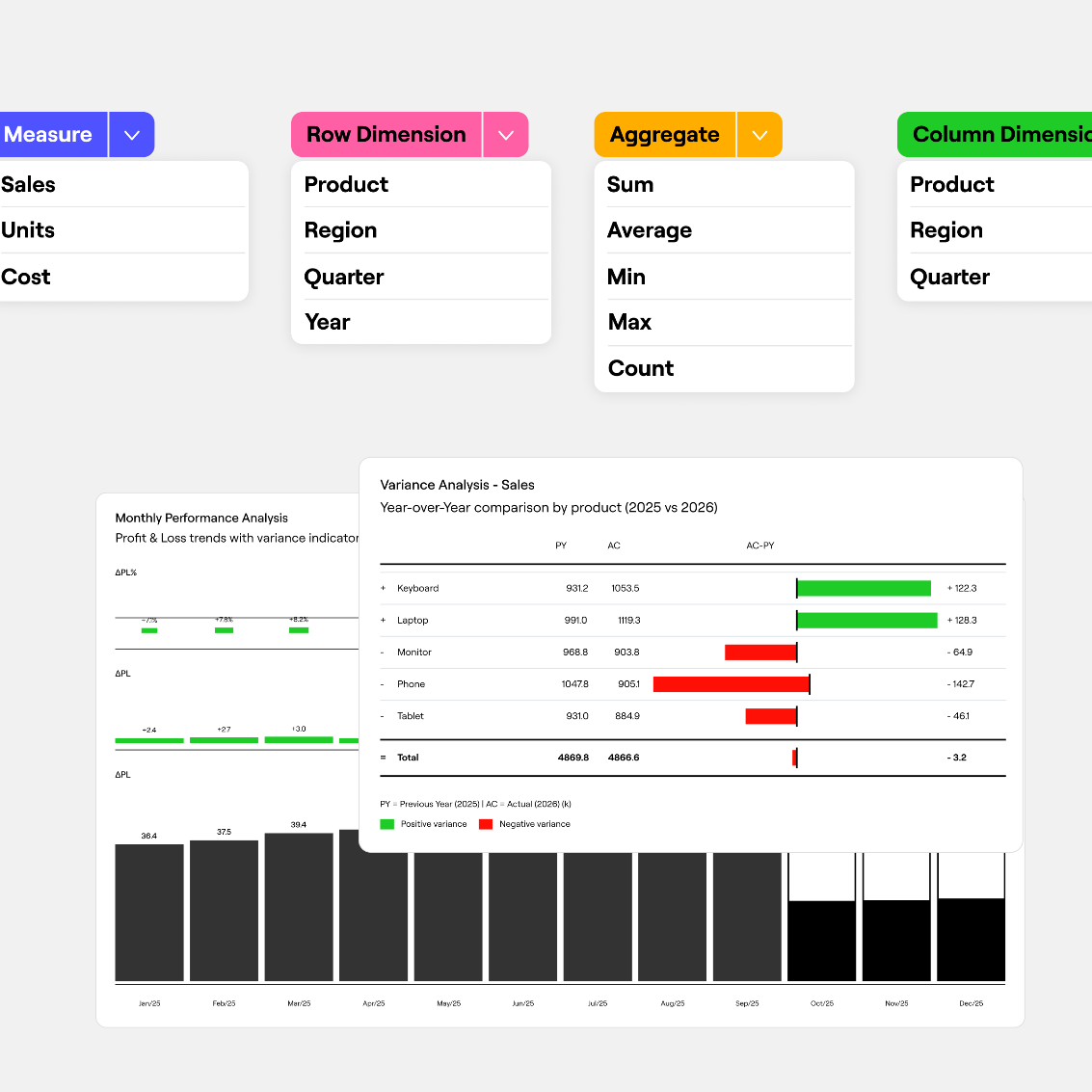
Variance analysis
Keep this section short. This is not the deep variance commentary you write at month end. It is a quick flag and not a detailed explanation.
Show actual versus budget or forecast for the headline metrics. Mark anything outside an agreed threshold, say 5% or a fixed money amount. For flagged items, add one line on the driver: volume, pricing, timing, or a one-off.
Commentary only on real deviations trains readers to pay attention when words appear.
Forecast updates
This is the section most teams skip, and it is the one that separates a reporting exercise from a planning tool.
Each week, ask: given what we now know, does the month or quarter outlook change? Most weeks, the answer is no, and you say so in one line. Some weeks, the answer is yes. Two deals slipped, a supplier raised prices, churn ticked up. The flash report should carry a revised directional outlook for revenue, cost, or cash when that happens.
That gives leadership three or four extra weeks to respond. That is the real value of flash reporting.
The Case for Automating It
A manual weekly flash report typically costs an analyst somewhere between half a day and a full day. Every week. Export from the ERP, export from the CRM, paste into the master file, fix what broke, chase the one number that looks wrong, format, send. Call it 20% of a full-time role spent producing a report whose entire value is speed.
And manual production undermines the report in three specific ways.
First, speed. When consolidation takes a day, the report shows up Tuesday afternoon describing a week that ended Sunday. The freshness that justifies the report decays while someone wrestles with copy-paste. Automation flips this. Data flows in overnight, and the report is ready Monday morning. Same-day reporting on Friday’s close becomes normal rather than heroic.
Second, accuracy and consistency. Manual reports break. A pasted range misses a row. A formula does not extend. Someone calculates churn slightly differently while covering a colleague’s holiday. Each error is small. Together they erode trust, and a flash report that leadership does not trust is worse than none, because people re-check everything and the speed advantage dies. Automation locks the calculation down. Churn is computed the same way every week because the same logic runs every week. Definitions stop changing between periods.
Third, real-time access. A spreadsheet emailed on Monday is frozen at the moment of sending. A live, automated report reflects data as it lands. When the CEO asks on Wednesday how the week is going, the answer is a link, not a request that costs an analyst three hours.
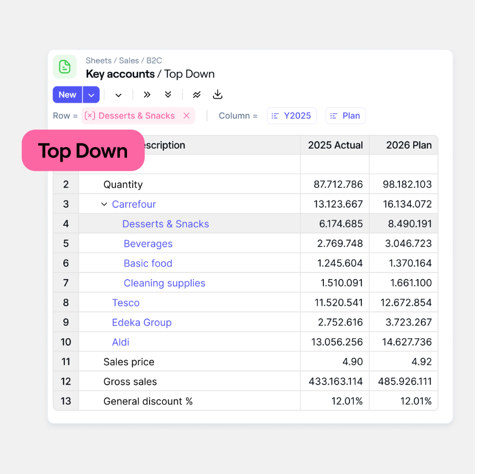
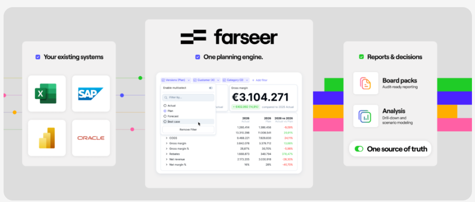
This is where modern FP&A platforms have changed the game. In a tool like Farseer, for example, the flash report is a live dashboard sitting on top of the planning model itself. Data refreshes from source systems automatically, and everyone from the CFO down looks at the same numbers at the same moment. Nobody asks which version of the file is current, because there is no file.
The last benefit is subtler: automation changes behavior. When weekly numbers are cheap to produce, weekly business conversations become normal. The analyst who used to build the report now spends that day explaining it. That trade is the whole point of FP&A.
How to Automate a Weekly Flash Report: 8 Steps
Automation projects fail from ambition more often than from technology. The path below is deliberately incremental.
Step 1: Define scope and metrics
Sit with the CFO and one or two business leaders and agree on the metrics that deserve weekly attention. Push hard on the difference between what matters weekly and what matters monthly. Aim for ten to fifteen metrics. Write down the definition of each one, precisely, because ambiguity here becomes an argument later.
Step 2: Map data sources
For every metric, identify where the number lives and how often it updates. Financials sit in the ERP. Pipeline and bookings sit in the CRM. Headcount sits in the HRIS. Operational metrics may sit in a warehouse system or BI layer. If a metric’s source only refreshes monthly, either revise the refresh frequency to weekly or drop the metric from weekly flash reporting.
Step 3: Select your tools
Three layers to think about. The planning and reporting layer is where FP&A platforms like Farseer live. The visualization layer is BI tools like Power BI or Tableau, if your platform does not cover it. The plumbing layer is integration: native connectors, APIs, or ETL pipelines that move data between systems.
A dedicated FP&A platform like Farseer shines when the flash report needs to talk to the plan. Comparing actuals to forecast weekly, and adjusting the forecast in the same place, is awkward across separate tools and natural inside one platform.
Step 4: Build the data pipelines
Now connect the sources. Automate the extraction, transformation, and loading so that data moves without a human touching it. The unglamorous heart of this step is standardization: one customer hierarchy, one calendar definition, one meaning for “bookings” across systems.
Step 5: Design the report layer
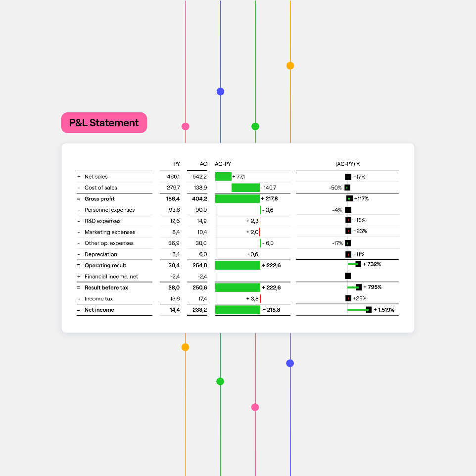
Build the actual report as a template or dashboard that populates itself. One page. Numbers on top, visuals below. The visuals that earn space in a flash report are trend lines across the last 8 to 13 weeks, a simple variance bridge for the headline metric, and KPI tiles with clear red-amber-green states.
Design for the ninety-second read. The CFO should absorb status at a glance and only slow down where a flag demands it. This is also where a platform approach pays off in a specific way. Because Farseer keeps actuals, forecasts, and dashboards in the same model, a flash dashboard there does something a static report cannot: a reader who spots a strange number can drill into it on the spot, down to the entity or account behind it, instead of emailing FP&A and waiting a day for the explanation.
Step 6: Automate distribution
The best report is worthless if people must remember to fetch it. Schedule the refresh and push the delivery: an email snapshot Monday at 7 a.m., a Slack or Teams post, or a standing link to the live dashboard. Also enable self-service. The report answers the first question. Stakeholders who can click into the dashboard themselves answer their own second question, which saves your team a shocking amount of ad-hoc work.
Step 7: Test and validate
Run the automated report in parallel with the manual one for three or four weeks. Reconcile them. You will find discrepancies. Most will be timing differences and definition mismatches rather than bugs, and each one you resolve now is a credibility problem you avoid later. Only retire the manual process when the numbers tie and the refresh has proven reliable. Trust is built in this step and almost nowhere else.
Step 8: Train and enable users
A report only changes decisions if people know how to read it. Walk stakeholders through the layout once. Explain what each metric means, what the thresholds are, and what to do when something flags red. Set the expectation that the flash report is directional, built for speed, and reconciled fully at month end. Say that out loud early, and the first small restatement becomes a non-event instead of a scandal.
Challenges to Watch For
A few honest warnings from the trenches.
Data quality and integrity. An automated report is only as good as its worst source. Inconsistent or delayed data will undermine trust. Put simple validation rules in the pipeline: completeness checks, range checks, a flag when a source did not refresh. A report that says “CRM data missing for Friday” keeps trust. A report that silently shows wrong numbers loses trust.
Integration complexity. Every additional source system multiplies the effort. APIs have limits, some systems only export overnight, and legacy tools may need creative plumbing. Start with two or three sources that cover 80% of the value. Add the rest later.
Speed versus accuracy. Weekly numbers will sometimes rely on estimates and incomplete data. That is by design, but only if you communicate it. Label estimates as estimates. State the assumptions. The danger is not being slightly wrong. It is being wrong silently.
User adoption. Some stakeholders will cling to the old format, or resist a new tool on principle. Involve the loudest skeptic in the design phase. A report someone helped shape is a report they defend in meetings.
Overloading the report. The most common failure mode. Every month, someone asks to add “just one more metric.” Two quarters later, the flash report is a 40-row monster nobody reads and the cycle starts again. Hold the line. For every metric added, ask which one comes out.
Best Practices From Teams That Do This Well
Keep it to one page or one dashboard view, forever, no exceptions. Pair every number with at most one line of commentary, and only where something deviates. Use visual cues, color coding and trend arrows, so status is readable before a single number is. Align weekly definitions exactly with monthly reporting definitions, so week four plus the flash reports roughly foots to the month-end story. And treat the report as a product: ask readers twice a year what they use, what they skip, and what they wish it showed, then prune accordingly.
The Bottom Line
A weekly flash report is one of the highest-leverage things an FP&A team can build. Not because it is sophisticated. Because it moves the moment of insight three weeks earlier, and three weeks is often the difference between fixing a problem and reporting one.
Start small. Ten metrics, one page, sent every Monday, even if the first version is half manual. Standardize it, then automate the ugliest parts of the process first. As your data matures, push toward the live-dashboard model where the report is always on and always current. Whether you get there with a BI tool or a planning platform like Farseer, the destination is the same: a finance team that spends Monday morning discussing what the numbers mean instead of assembling them.
The month-end close tells you what happened. The flash report gives you a chance to change it. That is worth automating.
FAQ
What is a weekly flash report?
A weekly flash report is a short, high-frequency management report that provides an early view of business performance before the formal month-end close. It typically tracks a small number of financial and operational metrics such as revenue, bookings, cash, expenses and key business drivers, helping management identify issues while there is still time to respond.
What should be included in a weekly flash report?
A weekly flash report typically includes revenue and sales metrics, selected expenses, cash and liquidity, business-specific KPIs, material budget or forecast variances, and any changes to the near-term outlook. The exact metrics should reflect the business model and focus on indicators that can meaningfully change from week to week.
What is the difference between a flash report and a monthly management report?
A flash report prioritizes speed and early warning, while a monthly management report prioritizes completeness and accounting accuracy. Flash reports use a limited number of directional metrics to identify emerging issues before the books close, whereas monthly reporting provides reconciled financial statements, detailed variance analysis and formal management commentary.
How many KPIs should a weekly flash report include?
There is no universal number, but a useful starting point is approximately 10–15 metrics. The goal is not to recreate the monthly reporting pack. Each KPI should either provide an early indication of future financial performance or highlight something management may need to act on during the week.
What are the best KPIs for a weekly flash report?
The best KPIs depend on the business model. SaaS companies might track bookings, ARR movement and churn; services businesses may track utilization and pipeline; manufacturers may monitor units produced, scrap rates and inventory; retailers may track same-store sales. Ideally, each operational KPI should connect clearly to revenue, cost or cash.
How is a weekly flash report different from a dashboard?
A dashboard provides continuously accessible performance information, while a weekly flash report creates a specific management cadence around the metrics that matter most that week. In practice, an automated dashboard can become the delivery mechanism for a weekly flash report, combining live data with agreed KPIs, thresholds and management commentary.
How do you automate a weekly flash report?
Start by defining the metrics and their data sources. Then connect the relevant ERP, CRM, HRIS and operational systems, standardize metric definitions, automate data pipelines, build a repeatable dashboard or report template, schedule distribution, validate the automated output against the existing report and train stakeholders to use it.
How accurate should a weekly flash report be?
A weekly flash report should be reliable enough for management decisions but does not need to replicate the precision of the month-end close. Estimates and preliminary data can be used where appropriate, provided they are clearly identified and assumptions are transparent. Final accounting numbers should still be reconciled through the normal close process.
How can FP&A use a weekly flash report for forecasting?
FP&A can use weekly actuals and leading indicators to assess whether the current monthly or quarterly forecast remains realistic. Significant changes in bookings, volume, pricing, churn, costs or cash can trigger a directional forecast adjustment or scenario review before the formal forecasting cycle.
What are the most common weekly flash reporting mistakes?
Common mistakes include tracking too many metrics, focusing only on lagging indicators, changing the format every week, providing commentary on every line, relying on inconsistent metric definitions, producing the report too slowly and automating unreliable source data. A strong flash report should remain short, consistent, timely and actionable.


What Great Financial Reporting and Analytics Actually Look Like
Read more
Ad Hoc Reporting for Finance Teams Who Can’t Wait on IT
Read more