3 Types of FP&A Dashboards That Drive Decisions

There’s a dashboard sitting in someone’s inbox right now that took a finance team three days to build.
It has thirty slides, fourteen charts, and three pivot tables that the analyst spent half a day wiring together from five separate system exports. It was emailed to the CFO on Monday morning with the subject line: “Q1 FY2026 – Full Performance Pack.”
The CFO opened it, scrolled for 45 seconds, and moved on to the next email.
Here’s the uncomfortable part: that CFO was right to ignore it. Not because Finance didn’t work hard. But because by the time the report landed in the inbox, the numbers were already five days old. The data had been pulled from the ERP on Wednesday, manually consolidated into Excel on Thursday, sense-checked and formatted on Friday, and emailed Monday.
Every decision in that “performance pack” was being made on last week’s reality.
This is the spreadsheet trap in FP&A reporting. And it’s not a skills problem. It’s a structural one. When your dashboards live in Excel, they’re snapshots of the past delivered late to the wrong person in the wrong format. They describe what happened. They rarely drive what happens next.
The finance teams that have solved this have done so by rethinking both what they build and how they build it. The best of them have moved away from static spreadsheet reports entirely and towards connected, live dashboards that serve three distinct audiences with distinct purposes built on a single source of truth, not a patchwork of manual exports.
The Core Problem with Excel Dashboards
Before we get into the three different dashboard types, it’s worth naming the specific ways Excel-based reporting fails because they’re different for each audience.
- For Senior leadership, the failure is staleness. By the time a CFO receives a manually assembled monthly pack, the window to act on what it contains has often already passed.
- For FP&A analysts and finance managers, the failure is time allocation. Research consistently shows finance teams spend 60–70% of their reporting time on data gathering and formatting, and less than 30% on the analysis that actually creates value. The model becomes the job, instead of the thinking.
- For Operational teams like collections, treasury, sales ops, the failure is frequency. Excel can’t give you a live bank balance or a real-time AR aging view. It gives you a snapshot from the last time someone manually refreshed it.
Three different audiences. Three different failure modes.
One common root cause: data that lives in disconnected systems gets manually stitched together in spreadsheets before anyone can see it.
This is the problem that platforms like Farseer are built to solve. Farseer connects your ERP, CRM, and HRIS data into a single centralised data warehouse (their Rama database) and runs your planning models, dashboards, and reporting directly on top of live data. When actuals change, every dashboard updates automatically. No exports. No manual refresh. No five-day lag. With that context, let’s look at the three dashboard types and what each one looks like when it’s built properly.
The Framework: Audience × Presentation
The foundation of all good FP&A reporting design is a single question: Who is consuming this, and what decision needs to be taken?
| Dashboard Type | Audience | Primary Question |
| Strategic Dashboard | CEO, CFO, Board | Are we on track strategically? |
| Analytical Dashboard | FP&A, Finance Managers, BU Heads | Why are we off track, and by how much? |
| Operational Dashboard | Collections, Treasury, Sales Ops | What needs my attention right now? |
One business. Three completely different conversations. Let’s go through each.
Dashboard Type 1: The Strategic Dashboard
Who It’s For: CEOs, CFOs, and Board members. Anyone making high-altitude decisions about the direction of the business.
What It Is: The Strategic Dashboard is the cockpit instrument panel of your business. Only the most critical gauges, nothing else. It provides a snapshot of overall organisational health: five to seven headline KPIs, each benchmarked against budget, each with a clear Red/Amber/Green status signal. A well-built strategic dashboard should be consumable in under two minutes.
Here’s the honest problem with building this in Excel: the moment you send it, it’s wrong. Not wrong in logic, but wrong in timing. The CFO who opens a monthly Excel pack on the 7th of April is reading data that closed on the 31st of March. A week of trading has already happened that the dashboard knows nothing about. And if anything material has changed, such as a deal closing, a large account churning, or a shift in cash position, they will find out when someone tells them, not when they look at their dashboard.
A properly built strategic dashboard doesn’t sit in an email attachment. It lives in a connected platform where the underlying data updates continuously. The CFO opens it before the board call and the numbers reflect this morning, not last week.
What Farseer Makes Possible
With Farseer’s live dashboards the strategic view updates automatically whenever underlying data changes in the connected model. When Q1 actuals close in the ERP, the strategic dashboard reflects them immediately. No analyst needs to extract, format, and resend.
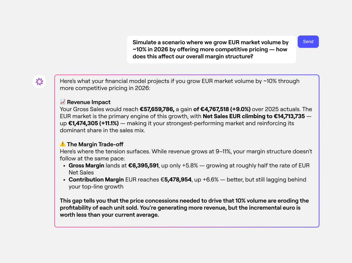
Beyond that, Farseer AI allows leadership to query their financial data the way they’d send a message. A CFO can type “simulate a scenario where we grow EUR market volume by 10% through more competitive pricing — how does this affect our margin structure?” and get back an instant, model-derived answer: revenue impact, gross margin movement, contribution margin. All calculated from the live financial model, without opening a dashboard or asking the FP&A team to rebuild anything.
In an Excel world, the narrative is typed by an analyst who spent Tuesday rebuilding the deck. In Farseer, the variance drivers behind every KPI are calculated automatically from the connected model, and the analyst’s job becomes interpretation and communication, not assembly.
Read: 15 Key Metrics to Track as KPI for Finance Department
Why It Drives Decisions
When the numbers are live, leadership stops asking “is this current?” and starts asking “what do we do about this?” That shift from validating data to acting on it is where Finance starts driving decisions rather than just describing them.
Dashboard Type 2: The Analytical Dashboard
Who It’s For: Finance managers, FP&A analysts, business unit heads and budget owners. Anyone who needs to understand why a number moved and not just that it moved.
What It Is: The Analytical Dashboard is the working engine room of FP&A. It lives one layer below the strategic dashboard and carries all the explanatory power the executive view deliberately strips out. Where the strategic dashboard answers “Are we on track?”, the analytical dashboard answers “why are we off track, and by exactly how much?”
This is where variance analysis lives. Revenue bridges. Cost walks. Segment breakdowns. Account-level accountability. It’s designed for someone willing to spend 20–30 minutes in it clicking through dimensions, comparing periods, drilling into specific drivers.
The Excel version of this dashboard has a fundamental limitation: It’s static. An analyst can build a beautifully formatted variance analysis, but the moment a BU head wants to filter it by region, or a colleague wants to understand what happened in a specific product tier, they either need to ask Finance to rebuild it or wrestle with the raw data themselves. Interactive filtering in Excel means pivot tables, slicer panels, and refresh buttons, each of which adds fragility and maintenance overhead.
More critically, the Excel analytical dashboard can’t connect your revenue variance to your underlying transactions. You can show that a customer segment is below plan, but tracing that shortfall to specific accounts, and then further into individual product categories, requires a separate lookup, a different file, and another manual reconciliation step.
What Farseer Makes Possible:
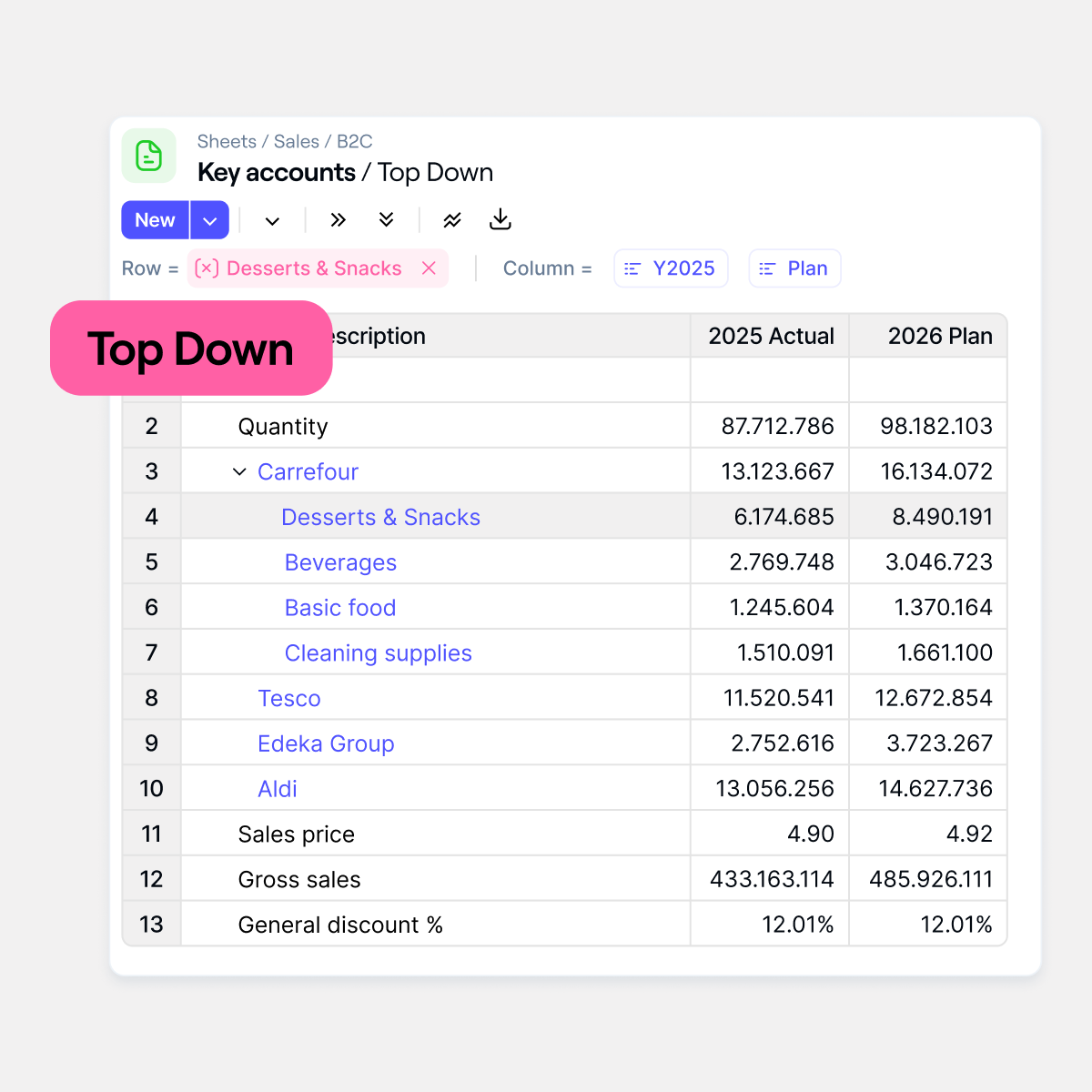
Farseer’s analytical dashboards are built on a live drill-down architecture. A finance manager looking at a Top-Down sales view can see total Quantity, click into Carrefour, and immediately see performance broken out by Desserts & Snacks, Beverages, Basic Food, and Cleaning Supplies — 2025 Actuals against 2026 Plan, in the same view, without leaving the dashboard. Tesco, Edeka Group, and Aldi. Every key account sits one click away. No separate file. No data request. No reconciliation step.
The Rama database underpins this. Because all source data (for example: ERP, CRM, billing system) is consolidated into a single structured warehouse, there are no reconciliation gaps between what the revenue dashboard shows and what the invoice-level detail confirms. The number at the top of the waterfall and the number at the bottom of the transaction list are the same number, traced through the same system.
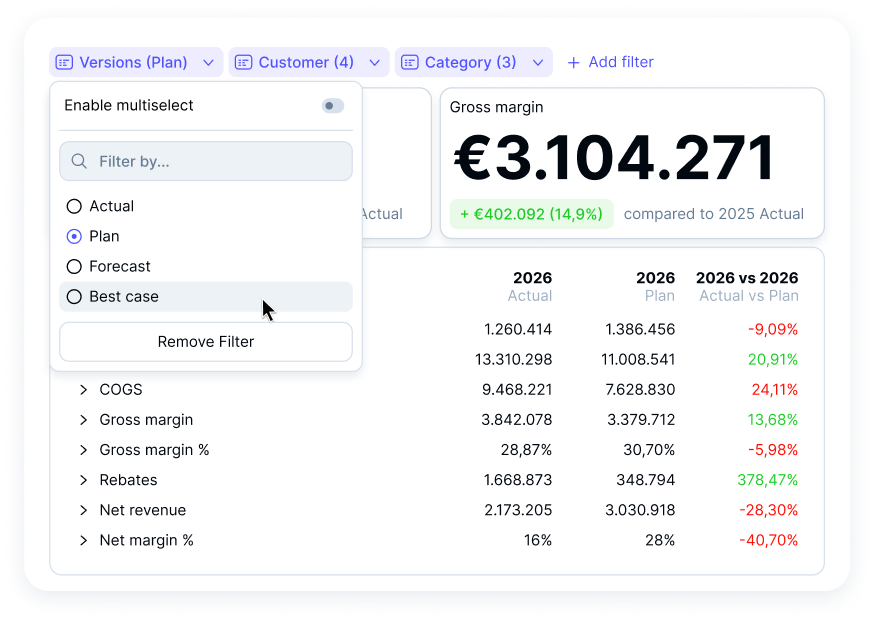
Farseer’s scenario planning capability also lives at this layer. An FP&A analyst can switch between Actual, Plan, Forecast, and Best-Case versions from a single dropdown — and watch the entire view update instantly. The 2026 Actual vs Plan comparison table — COGS, Gross Margin %, Rebates, Net Revenue, Net Margin % — recalculates across every line simultaneously. Filter by Customer or Category and the scenario view narrows in real time.
In Excel, running the same comparison means maintaining separate scenario tabs, manual formula links, and version control discipline that almost no team actually keeps. In Farseer, it’s a single click that updates everything at once.
Dashboard Type 3: The Operational Dashboard
Who It’s For: Collections managers, treasury, sales operations and shared services. Anyone managing activities that change by the hour and not by the month.
What It Is: The Operational Dashboard is the pulse monitor of the business. It doesn’t look backwards at monthly results or sideways at budget gaps. It looks at what is happening right now and specifically, what requires action in the next few hours.
In an FP&A context, operational dashboards cover: live cash position vs. minimum threshold, daily accounts receivable collections vs. expected inflows, overdue invoice tracking by aging bucket, and pipeline progress against the weekly booking target.
The Excel failure here is the most obvious of all. Excel cannot show you a live bank balance. It cannot tell you that an invoice crossed 90 days this morning. It cannot alert you that a deal is three days past its expected close date. It is, by definition, a historical tool. Operational decisions happen in minutes and hours and not in the next monthly reporting cycle.
The most dangerous version of this failure is in cash management. A treasury team that relies on a weekly Excel cash flow update doesn’t know about a collections shortfall until it’s already happened. By the time the next refresh runs, the gap has widened, options have narrowed, and the CFO is hearing about it in a meeting instead of seeing it on a dashboard.
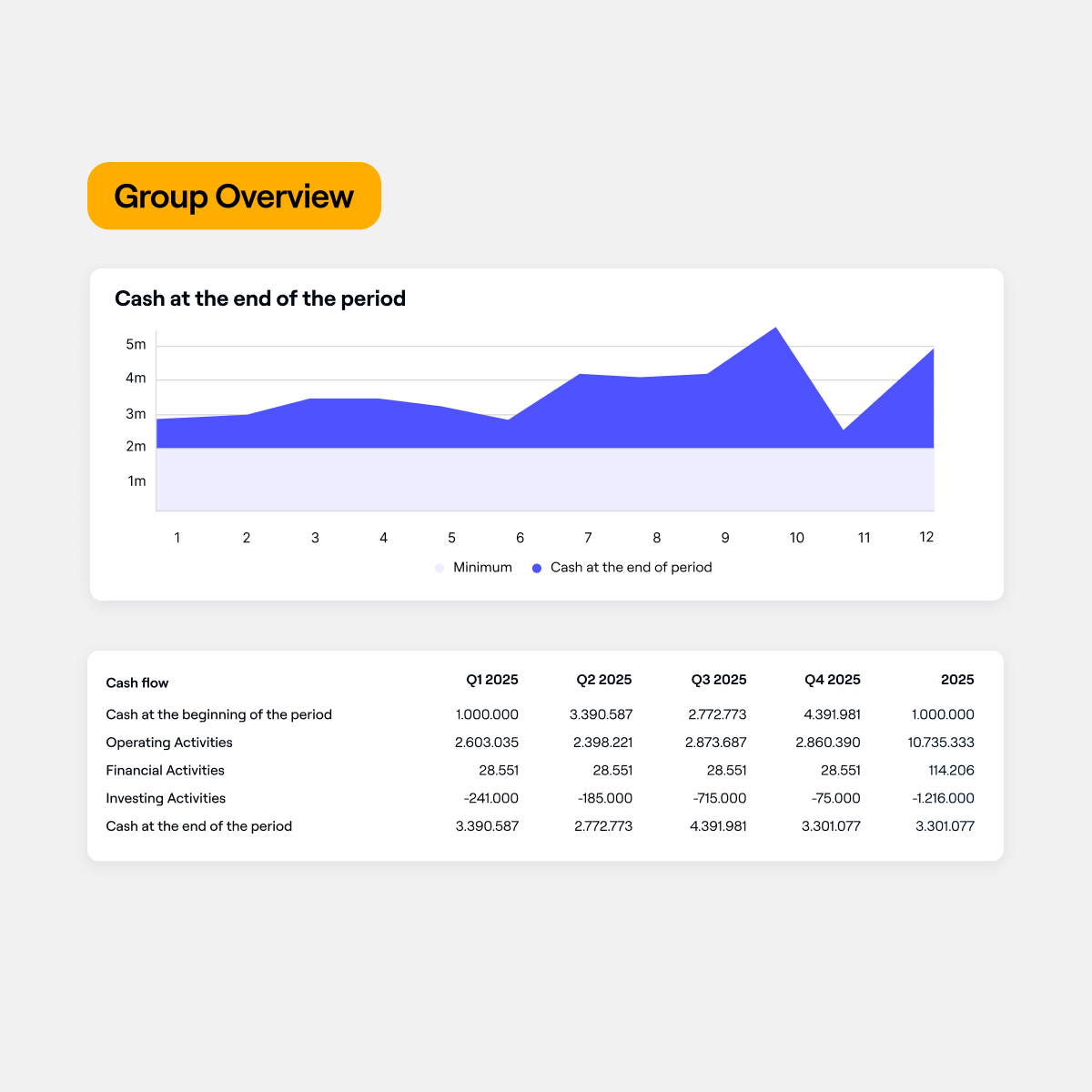
What Farseer Makes Possible: Farseer’s cash flow forecasting gives finance teams a live Group Overview that shows exactly where cash will be at the end of every period plotted across all 12 months against a minimum threshold line, so a dip toward the floor is visible weeks before it becomes a crisis.
Below the chart, the full cash flow statement breaks down Operating, Financial, and Investing Activities by quarter — Q1 through Q4 and full-year, all calculated from the same connected model. When a payment lands in the ERP, the period-end cash position updates. When the forecast dips below the minimum threshold, the chart shows it immediately. The operational collections view and the strategic cash runway KPI are powered by the same data source, which means every number from the invoice level to the board summary always ties up.
Read: Consolidated Cash Flow Statement: Definition, Example, and Modern Approach
The Thread That Connects All Three
Here is what makes this framework worth taking seriously: all three dashboards must tell the same story at different altitudes. In an Excel environment, keeping these three layers consistent is a manual, error-prone exercise. Someone has to make sure the segment total on the analytical dashboard matches the revenue KPI on the strategic view. Someone has to check that the AR aging snapshot in the operational tracker reconciles to the same closing balance referenced in the CFO narrative. That reconciliation work is real and it consumes real analyst time every single month-end.
In Farseer, consistency is structural. Because all three dashboards draw from the same Rama data warehouse and the same connected financial model, they always agree. The CFO doesn’t need to ask “is this the same number as what collections showed me?” It is, by design, the same number.
A Practical Note on Getting Started
If your reporting is currently built in Excel and you’re thinking about what the transition looks like, the honest answer is: it doesn’t happen overnight. The teams that do it well start with one dashboard type, usually the operational view, because the data quality problems are most visible there and build out from there as the model matures.
What changes first is not the dashboards themselves. What changes first is the underlying data discipline: getting the ERP feeds clean, agreeing on KPI definitions across departments, and building the driver logic that makes the variance analysis automatic rather than manual.
Read: What Great Financial Reporting and Analytics Actually Look Like
Farseer’s data management and implementation process is structured around exactly this, starting with data unification before building reporting on top of it.
The teams that try to build live dashboards on top of messy, disconnected data get the same result as before, just faster. The teams that solve the data layer first find that the dashboards almost build themselves.
Your 3-Step Action Plan
Step 1: Audit who actually uses what. For every report your team sends, identify: who opens it, and what do they do with it? If your analytical dashboard is going to your CEO and your strategic summary is going to your team leads, you have an audience mismatch — and it explains why neither group feels Finance gives them what they need.
Step 2: Define the one question each dashboard must answer. Strategic: “Are we on track?” Analytical: “Why, and where?” Operational: “What needs action right now?” If a dashboard can’t answer its assigned question in under two minutes, it needs a rebuild and more data is not the solution.
Step 3: Identify your biggest data lag problem. Which dashboard currently takes the most manual effort to produce? That is your starting point. That lag, whether it’s the day-old cash position, the five-day-old board pack, or the weekly AR aging report, is the friction that a connected platform eliminates first.
Final Thought
The best thing Finance can do for a business is not produce more data. It is to make the right data impossible to ignore. A well-designed strategic dashboard removes ambiguity from leadership decisions. A rigorous analytical dashboard gives FP&A the credibility to challenge assumptions and drive the conversation. A live operational dashboard turns reactive fire-fighting into proactive management.
That is what dashboards that actually drive decisions look like. Not 40 tabs in a spreadsheet. Not a monthly email attachment with a five-day lag. Three connected views, built on live data, each designed for a specific audience and a specific decision. All three tell exactly the same story.
The companies getting this right are not waiting for the month-end to understand their business. They already know.
Want to see this in action for your own data?

FAQ
What are FP&A dashboards?
FP&A dashboards are visual reporting tools used by finance teams to track financial performance, analyse trends, and support decision-making. They consolidate data from multiple systems into a single view, helping stakeholders understand key metrics such as revenue, costs, and cash flow.
What are the different types of FP&A dashboards?
The three main types of FP&A dashboards are strategic, analytical, and operational dashboards. Strategic dashboards provide high-level performance insights, analytical dashboards explain variances and drivers, and operational dashboards focus on real-time actions and short-term decisions.
What is a strategic dashboard in FP&A?
A strategic dashboard is a high-level view designed for executives such as CEOs and CFOs. It typically includes 5–7 key performance indicators (KPIs) with clear status indicators, helping leadership quickly assess whether the business is on track.
What is an analytical dashboard in FP&A?
An analytical dashboard is used by FP&A teams and managers to understand why performance has changed. It includes variance analysis, drill-down capabilities, and detailed breakdowns by segment, product, or region to identify root causes.
What is an operational dashboard in FP&A?
An operational dashboard focuses on real-time business activities and immediate actions. It includes metrics such as cash position, accounts receivable aging, and pipeline tracking, helping operational teams respond quickly to changes.
Why do Excel-based dashboards often fail?
Excel-based dashboards often fail because they rely on manual data updates, leading to delays, errors, and version control issues. By the time reports are shared, the data may already be outdated, reducing their usefulness for decision-making.
How do live dashboards improve decision-making?
Live dashboards improve decision-making by providing real-time data updates, ensuring that users always see the latest information. This reduces delays, eliminates manual errors, and allows teams to act on current business conditions rather than outdated reports.
What is the difference between reporting and decision-making dashboards?
Reporting dashboards describe past performance, while decision-making dashboards provide actionable insights. The key difference is that decision-making dashboards are timely, interactive, and designed to answer specific business questions.
What is a single source of truth in FP&A dashboards?
A single source of truth refers to a unified data system where all financial data is consistent and centrally managed. This ensures that all dashboards, reports, and analyses are based on the same data, eliminating discrepancies and reconciliation issues.
How can FP&A teams improve their dashboards?
FP&A teams can improve their dashboards by defining the audience, focusing on key business questions, reducing manual processes, and using connected data systems. Moving from static spreadsheets to live, integrated dashboards significantly enhance accuracy and usability.

Digital Transformation in Finance: How Finance Teams Break Out Of Digital Planning Purgatory With AI
Read more
Farseer raises $7.2M Series A to build the Enterprise Operating System for Finance
Read more