
This post focuses on four KPIs that actually help. Not academic theory. Real metrics that show where your forecast goes off track and how to improve it.
Let’s keep it sharp and useful.
Demand Planning vs Demand Forecasting
Demand forecasting and demand planning often get used interchangeably, but they’re not the same thing.
Demand forecasting is the process of predicting future sales using historical data, market trends, and seasonality. It’s focused on numbers: how much, when, and where.
Demand planning takes that forecast and turns it into a concrete plan. It answers questions like: How much stock do we need? When should we reorder? Do we need to shift production or adjust supplier lead times?
Your forecast drives the plan, so if it’s off, your entire supply chain feels it.
The accuracy of your forecast depends heavily on the forecasting model you use. Some companies go for high-level, strategic models. Others use granular, SKU-level inputs. If you’re deciding between these, read more on bottom-up vs top-down forecasting.
Model choice affects accuracy, and ultimately, your KPIs
Why Forecast Accuracy Metrics Matter
Forecasts are never perfect, but they need to be close enough to help you make smart decisions. Without the right KPIs, there’s no way to tell if your forecast is working or just adding risk.
Inaccurate forecasts lead to overproduction, stockouts, lost revenue, and stressed teams. Worse, nobody knows where the problem actually is. You’re adjusting plans without knowing if the data behind them was any good to begin with.
The right demand forecasting KPIs show you two things:
- How close your forecasts are to reality
- Where your model consistently goes off track
That’s why we’re focusing on four that do both. They’re the ones that finance and supply chain teams actually use, because they expose issues quickly and lead to real improvement.
Why These 4 Demand Forecasting KPIs?
You can only improve what you measure. Demand planners often chase the one metric that will finally give them better accuracy. But with dozens of options out there, it’s easy to lose focus.
This blog sticks to four demand forecasting KPIs that are actually used:
- Forecast Accuracy / Forecast Error
- Bias (Mean Forecast Error)
- Mean Absolute Percentage Error (MAPE)
- Weighted Mean Absolute Percentage Error (WMAPE)
We picked these because they’re practical, easy to track, and relevant for most planning setups. They help you measure both how wrong you were and in which direction, which is what really matters when you’re trying to improve.
You don’t need ten KPIs. Just use the right ones, consistently.
Of course, no metric works on its own. You still need to choose the right forecasting method. There’s no single formula that fits every case, so pair these KPIs with solid model logic and business assumptions.
Forecast Accuracy / Forecast Error
Let’s start with the most straightforward KPI.
Forecast Accuracy tells you how close your forecast was to actual demand. It gives you a simple way to measure whether your numbers were in the right ballpark.
You’ll usually see this one expressed as Forecast Error — because it’s easier to track how wrong you were, than how right.
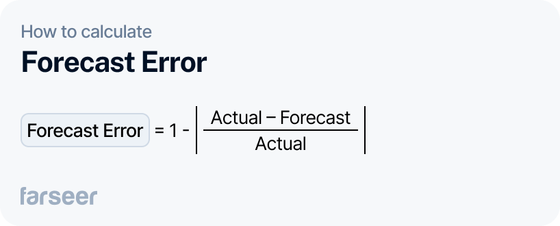
How to calculate it
Forecast Error = 1 – |(Actual – Forecast) / Actual|
This gets you a percentage. A 0% error means a perfect forecast.Why it matters
You can’t manage inventory or production based on vibes. If your forecast accuracy is low, you’ll see it in overstock, stockouts, and urgent fixes that eat into margins.
This KPI helps you:
- Track forecast performance over time
- Compare forecasting models
- Set realistic expectations across departments
Example: A retail chain forecasts sales of 10,000 units of a new seasonal product. Actual sales end up at 8,500.
Forecast Error = 1 – |(8,500 – 10,000) / 8,500| = 17.6%
That means the team missed by 17.6%. Alone, that might be okay, but if the forecast is off by this much across multiple product lines, they’re looking at excess inventory, tied-up working capital, and missed markdown opportunities.
If you’re tracking this KPI weekly or monthly, you’ll quickly see which SKUs or categories are consistently off, and you can dig deeper to fix the model or adjust assumptions.
For long-term improvements, make sure your planning model fits your business. Here’s how to choose between top-down and bottom-up forecasting.
Bias (Mean Forecast Error)
Forecast Accuracy tells you how far off you were. Bias tells you which direction you consistently miss — whether your team keeps overestimating or underestimating demand.
It’s one of the fastest ways to figure out if your forecast logic is broken. A forecast can look accurate on average, but still be totally useless if it’s always skewed to one side.
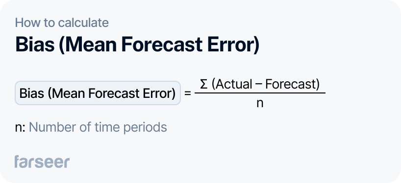
How to calculate it
Bias = ∑(Actual – Forecast) / n
Where:
- Actual = what really happened (sales, units sold)
- Forecast = what you predicted
- n = number of time periods
If the result is positive, you’re under-forecasting. If it’s negative, you’re over-forecasting.
Why it matters
If your team consistently over-forecasts, you’ll end up with excess stock, waste, and working capital locked in inventory. If you’re under-forecasting, you’ll keep running into stockouts, backorders, and missed revenue.
Bias also signals deeper issues in how the forecast is being built: outdated baselines, unrealistic sales targets, or manual adjustments that skew the numbers.
Example: A FMCG company sells dairy products with short shelf lives. Over the past 12 weeks, actual demand averaged 9,500 units, but the forecast kept saying 10,200.
Bias = (9,500 – 10,200) / 12 = –58.3
That’s a consistent over-forecast. The number looks small, but over time, it means unnecessary production, logistics costs, and expired stock. The team needs to look at the forecast inputs; maybe last year’s seasonal uplift is no longer valid.
This is why Bias is one of the most useful early-warning KPIs. It tells you to fix your model before it impacts your P&L.
Mean Absolute Percentage Error (MAPE)
Another great demand forecasting accuracy KPI. You will probably use MAPE most of the time. And for a good reason: it is simple, everyone understands it, and there are only a few accuracy tradeoffs when using it.
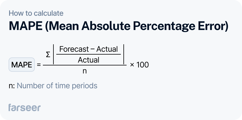
How to calculate it
MAPE = ∑ |(Forecast – Actual) / Actual| ÷ n × 100
Where:
- Actual = what really happened
- Forecast = what you predicted
- n = number of periods
The result is a percentage. A lower MAPE means better accuracy.
Why it matters
MAPE is simple and widely accepted. You can use it to benchmark across departments, categories, or even companies. It’s easy to communicate to non-technical stakeholders, too.
But it has two key weaknesses:
- It breaks down when actuals are very low or zero (you end up dividing by zero or inflating the error).
- It treats all errors equally, no matter the product value or strategic importance.
Example: A pharma distributor forecasts 5,000 units for a medication. Actual demand is 4,500.
MAPE = |(5,000 – 4,500) / 4,500| = 11.1%
That’s not bad — but when the same team gets a 50% MAPE on a rare, high-margin product with tight availability, that’s a big problem. And MAPE won’t highlight that. That’s where WMAPE comes in.
For higher accuracy on low-volume items or high-value SKUs, MAPE should always be paired with a weighted metric.
Weighted Mean Absolute Percentage Error (WMAPE)
WMAPE fixes one of MAPE’s biggest flaws — it gives more weight to what matters. Not every error is equal. If you miss by 10 units on a slow seller, no one notices. Miss by 10 units on a key product, and you’re in trouble.
That’s where WMAPE shines. It weights the error by actual demand, so large, high-impact items count more than fringe ones.
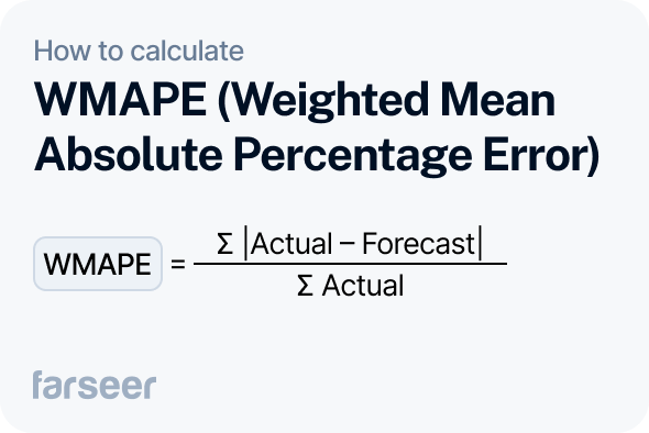
How to calculate it
WMAPE = ∑ |Actual – Forecast| ÷ ∑ Actual
It gives you a percentage, just like MAPE. But it reflects volume impact, not just the number of errors.
Why it matters
Most companies track dozens or hundreds of SKUs. With MAPE, you risk overreacting to small errors in low-volume products. WMAPE brings your attention back to high-impact misses — the ones that affect revenue, service levels, and operations.
If you’re managing large assortments or doing demand planning for high-value items, this is one of the most useful KPIs you can track.
Example: A retail brand forecasts demand for two products:
- Product A: Forecast 5,000 | Actual 4,500
- Product B: Forecast 300 | Actual 100
MAPE would show a huge error on Product B (200% error). But WMAPE puts more weight on Product A, because it matters more. That gives a more realistic view of overall performance.
This is especially useful when you’re reporting to execs. No one wants to optimize for minor SKUs while your key revenue drivers are off.
In Farseer, WMAPE is calculated automatically across time series and product hierarchies; no spreadsheets needed.
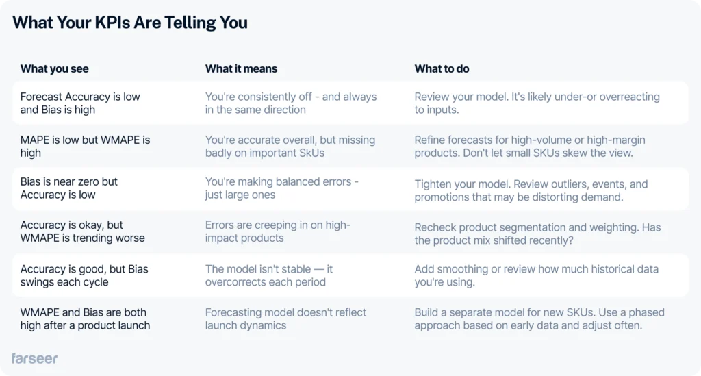
What Your KPIs Are Telling You
Tracking KPIs is step one. Knowing what they’re telling you — and what to do next — is where the value is.
Use this table to decode patterns and turn metrics into action:
Automate These KPIs in Farseer
You don’t need to spend hours calculating these metrics manually. Farseer tracks Forecast Accuracy, Bias, MAPE, and WMAPE across products, periods, and teams in real time.
You can:
- Set accuracy thresholds per product group
- See trends instantly on dashboards
- Drill into WMAPE to find which SKUs are throwing you off
- Spot and correct bias before it compounds
Everything updates automatically as your forecasts change. No more exporting data, cleaning it in Excel, or guessing what went wrong last month.
Book a demo to see how your team can improve forecast accuracy without increasing workload.